NEXUS
[2023] For its two year aniversary, we rebranded NEXUS. The new look was developed to be minimal, adaptable, yet recognisable.
Nexus is a techno collective from Vienna that is dedicated to creating inclusive events.
I joined the collective in the beginning to support them with visuals, develope their graphic identity and social content as I align very much with their ideals and wishes for a more inclusive reality with equal opportunities.
With its commitment to social equity and community-centric attitude, NEXUS is making an anti-capitalist statement in an industry that is increasingly commercializing the subculture-born events that are raves.
Besides a strictly enforced anti-discriminatory code of conduct, NEXUS also tires to offer affordable ticket prices at all our events that should allow everyone who is interested in attending the event to do so, even if their financial means are limited.
To get a picture of the ongoing development, take a look at the collective's Instagram page.
category
branding, social media content
logo
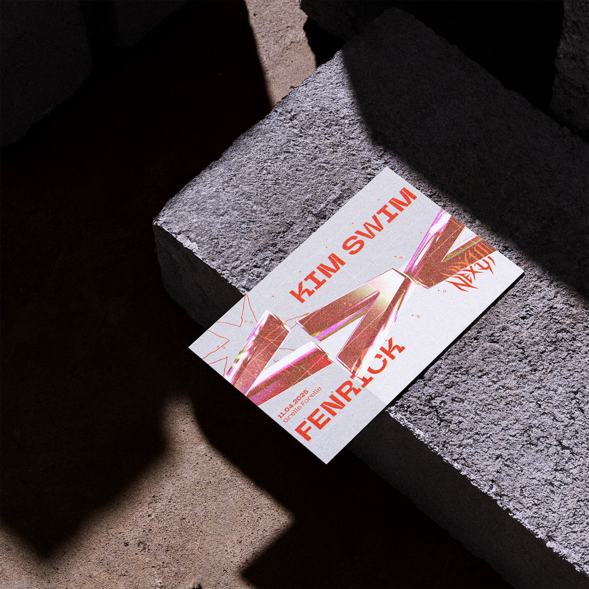
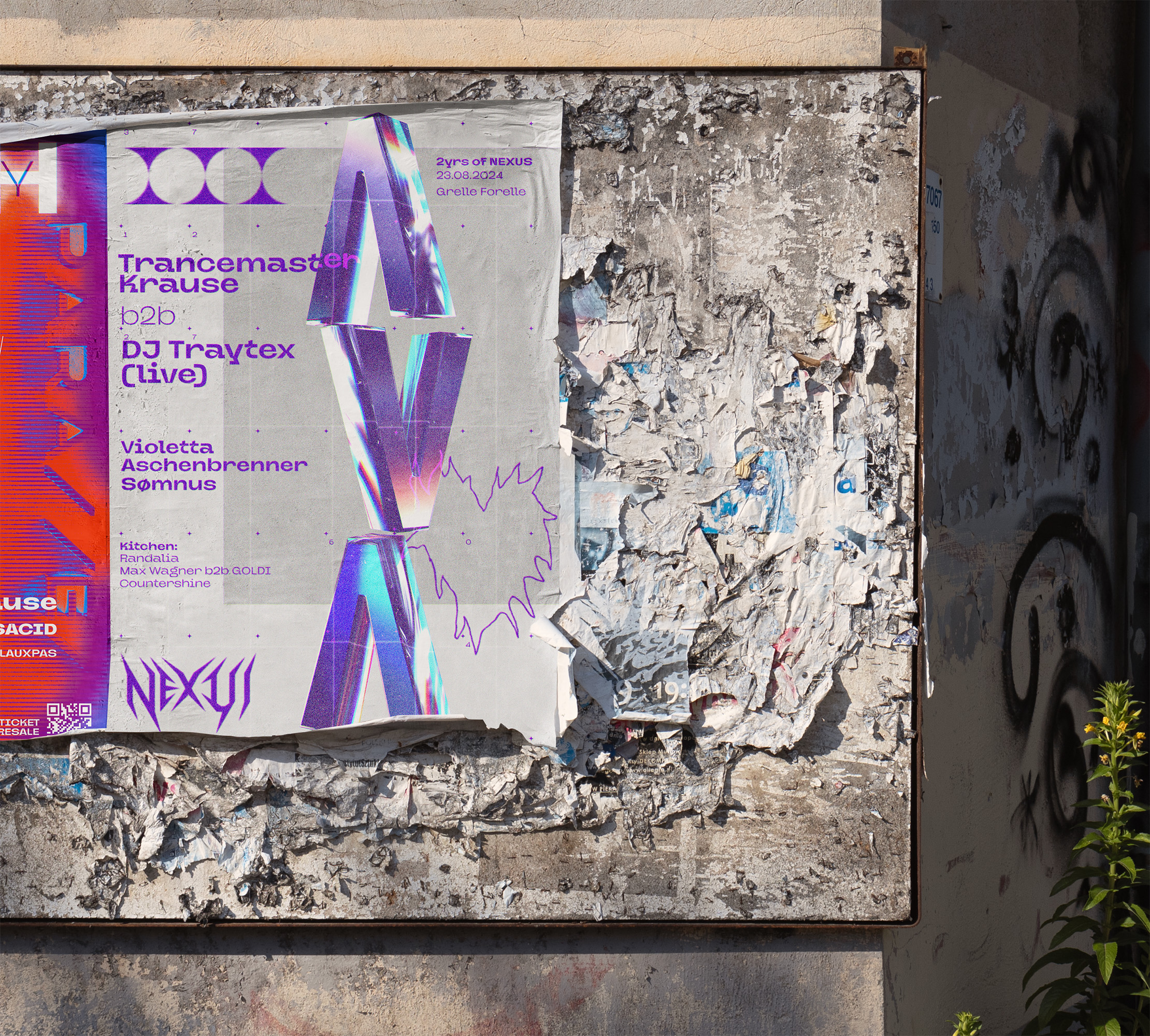
The logo was designed to be bold, readable and recognizable in the vast landscape of techno collectives. 'nexus' in latin means 'connection, act of binding, tying or fastening together'. Therefore the the letters point in a concentric direction towards the X.
scribbels
DIY is at the core of NEXUS. Quick, a bit dirty, but always with soul. Hand-drawn analog scribbles of contemporary iconography are the basis of the decorative elements used in the design, both as fineline graphics and 3D glass elements.
glass elements
Bold, refracting glass elements are the main eye-catchers but move in conjunction with the text. Not obscuring, but adding a layer of interest.
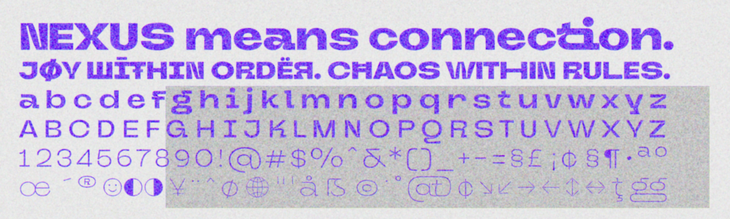
typography
The Neue Metana Next by dirtylinestudio.com was chosen because of her modern minimalist and geometric appearance whilst still possessing playful and quirky details. This seemed quite in line with NEXUS.